
Zestie
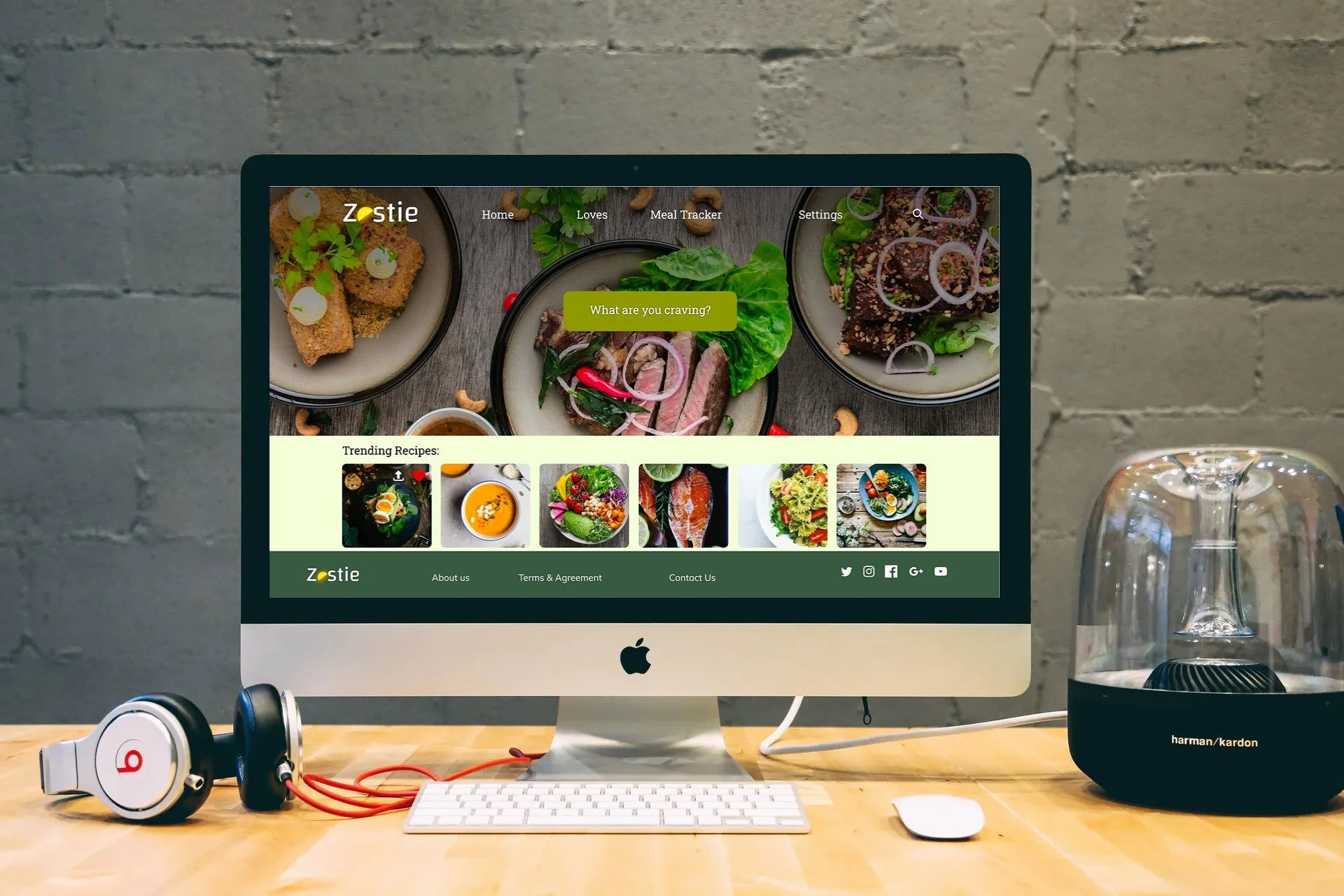
Zestie is a mobile wellness app I designed. The app allows users to easily prepare recipes from different categories of ethnic foods, allowing them to consider culture when choosing nutritious meals.
Click image to watch video on how the app functions.
About the Project
Zestie is a mobile wellness application that I created to provide people with healthy recipes that acknowledge different cultural foods and eliminate the guilt of calorie tracking that other apps have. This project was completed in two weeks. I conducted user research to understand people's relationships with mental, physical, and emotional well-being. After this, I developed Zestie to drive them to action. With this app, users set a goal of cooking at least five meals per week. The following will go on to describe the process that went into researching, designing, and finally prototyping the final product.
How might we make an app that offers easy meal prep recipes that are viewed positively by those looking to learn better cooking habits?
Key Survey Findings
In total, we received 72 responses, and from those responses, we were able to get the information outlined below:

When looking at the data, we found that 61% of people had a goal to focus more on their diet and what they were eating when it came to health. Below 76% indicated they struggled with diet or weight loss/gain when it came to health.

The third key finding in my survey let me know that people weren't meeting or achieving their goals due to a lack of knowledge (22.1%) and companionship (19.7%). This begs the question: Do people feel like they need someone or something to make them feel more accountable?

To answer these questions or even identify if it was a problem, I moved on to interviews so I could get further insights on the real root cause of the problem.
When it came to interviewing, there were 8 users who participated and gave feedback on their struggles when it came to health and what they felt they needed.
The insights I found most interesting were that 6 out of 8 people identified dieting and eating better as one of their main struggles. One user said, "I don't like a lot of super healthy food heavy on salads, so I give up and always go back to my comfort food." Many who had or have apps said they'd stopped using them because it made them feel "guilty, especially when using diet apps, because I feel so bad when I look at the calorie count, especially if you have a day where you order food." Many people had the intention to be healthy and eat a balanced diet, but many didn't know how to. Others said, "I am not good at cooking.” I also had people say, "Even if I know what to cook, I don't have time, or just don't know what to cook." So people did not know what to cook, and even though they did, they wanted food that was healthy and comforted them at the same time. According to some interviewees, many diet apps don't consider culture when giving recipes or meal prep ideas.
Interview Insights
To better understand the market, I decided to do a competitive analysis. The marketplace is saturated with health apps offering everything from meal-tracking to collecting recipes, such as the Tasty app. Very few health apps allow you to view recipes based on specific categories. Some of the apps I compared were Mealtime, in which you build your meal plan, and full access to recipes is locked behind a paywall; Very inconvenient for end users. I also compared Yummly, but that wasn't very useful as all of their content is also behind a paywall. At ~$30 a year, this isn't convenient for someone looking for an app that’s fast and easy to use. Finally, I compared HealthyFood; HealthyFood seems like a good app as it gives users nice recipes. However, it is also paywalled at either $5 per week or $40 a year. These barriers scare away many users.
Competitive Analysis
User Research
After this, I decided to do my Lean UX Canvas to more thoroughly brainstorm my process. It allowed me to write down my business problem, a hypothesis solution to my problem. Below is a detailed canvas explaining where my process for the design was heading.

I then did my UX blueprint strategy, which helped me to be able to look into my design process. I was able to identify where I was, what I had so far, and the next steps I needed to complete before going into my actual UI sketching and testing.

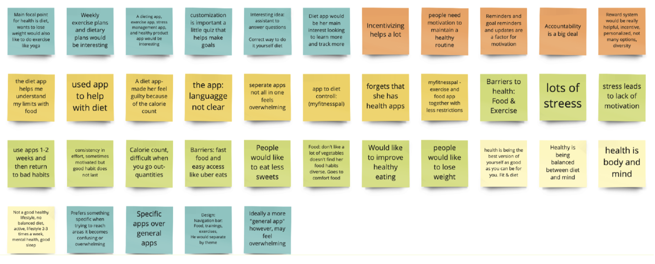
Moreover, I decided to work on my Affinity map so that I could write down everything I had observed, been told, and noticed from my interviews. My affinity map let me know that many people wanted an app that would get rid of the guilt of having a diet app and also let them enjoy their cultural foods with staple foods such as rice or beans. It also gave me the insight that many wanted or at some point had even had an app, but had stopped using it and reverted to old habits, as many felt they needed motivation to continue, which many apps did not provide. There was no reward system in place for many.
User Persona
Below shows my user persona, her story, and her journey. Her name is Janice Young, an accomplished HR Recruiter who has trouble coming up with what to cook and order in way too much. She is of Vietnamese descent and wants recipes that will allow her to feel more connected with her culture, especially since she lives in Portland, Oregon, and misses the family she has back in Vietnam.

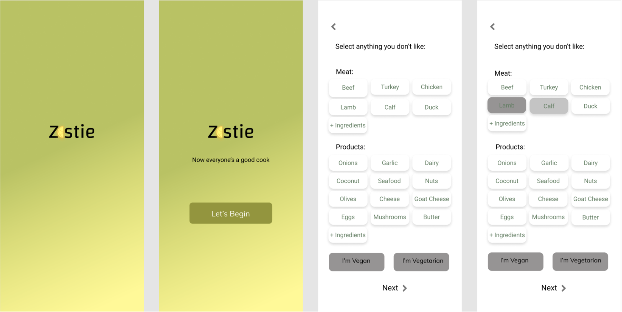
With my user in mind, a clear problem statement, and research it was time to move on to sketching the lo-fi version of what would become Zestie.
UI Design

My designs for this project were focused on my user and her journey through the app. For my lo-fi, I made a few screens (not featured) in which the user first needs to answer a few questions regarding ingredients or products they did not like, so we could personalize the recipes they received. This question would be followed up by how many servings per meal the user would like to cook. Then the user is asked to set up a goal of how many meals they plan to cook per week. Finally, before entering the home page, they would be asked if they would like to set a reminder. My user flow made it clear what the task was for the user and what they would do if they were to follow their happy path.

Mid-fi
Once I tested with several users, I was able to adjust my lo-fi models to provide clarity. For example, many users expressed confusion around the arrow on the Instruction page; it was unclear what this button did, so it was removed. Another significant change from lo to mid-fi is that when people click on Instructions, it will show detailed instructions with video as opposed to just showing one page with text.


Moscow Analysis
I also did my Moscow Analysis, where I was able to decide what my MVPs were and what I would definitely not include in my app.

Mood Board
For the app, I wanted the platform to be green to have a fresh and tasty feeling. The images of food needed to be crisp and clear, and any animations needed to be rounded. In order to have a visual representation, I made a mood board.
High-fi
Finally, after A/B testing, iterating, and testing with users, my High-Fi prototype was ready. Please look at the video at the top of the page to see it in action! Also available on Web and Android.
